Xamalink – Strategy Meets Design.
Repositioning a Data-Driven Tech Company.
StudioAugustin developed the new brand identity for Xamalink with the aim of translating the company’s complex, data-driven services into a clear, future-ready presence—visually strong, strategically grounded, and digitally functional. The result: a confident brand identity that builds trust, creates clarity, and supports growth.
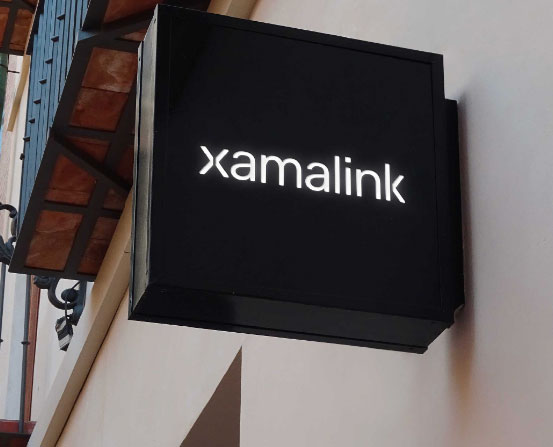
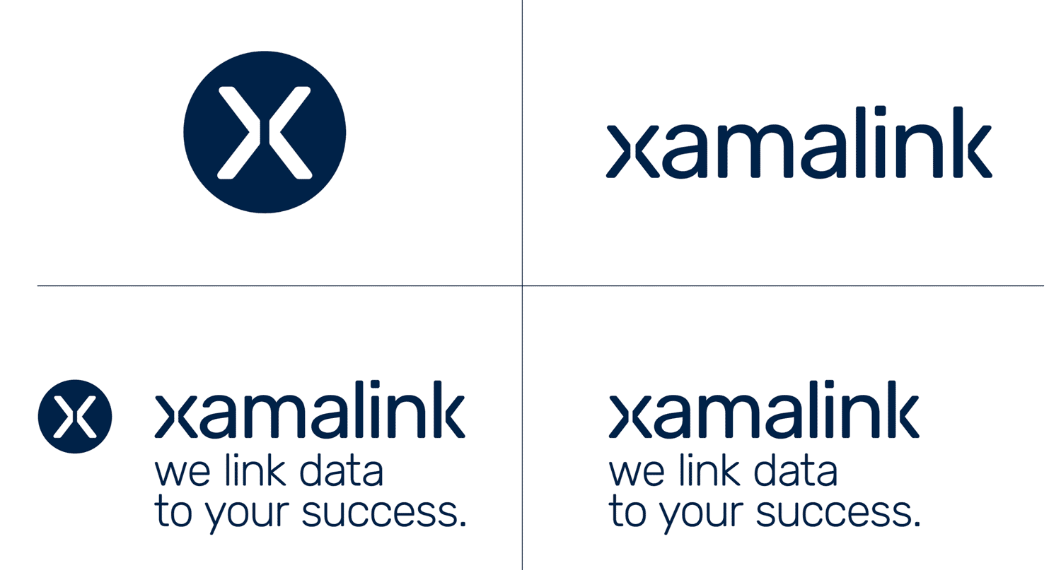
The starting point and key element of the new identity is the logo: a typographic solution derived from the word xamalink itself. Letterforms from the beginning and end of the word mirror each other, creating a custom ‘x’ with a central negative space. This ‘x’ not only reflects the name but also works as a strong, standalone brand mark.
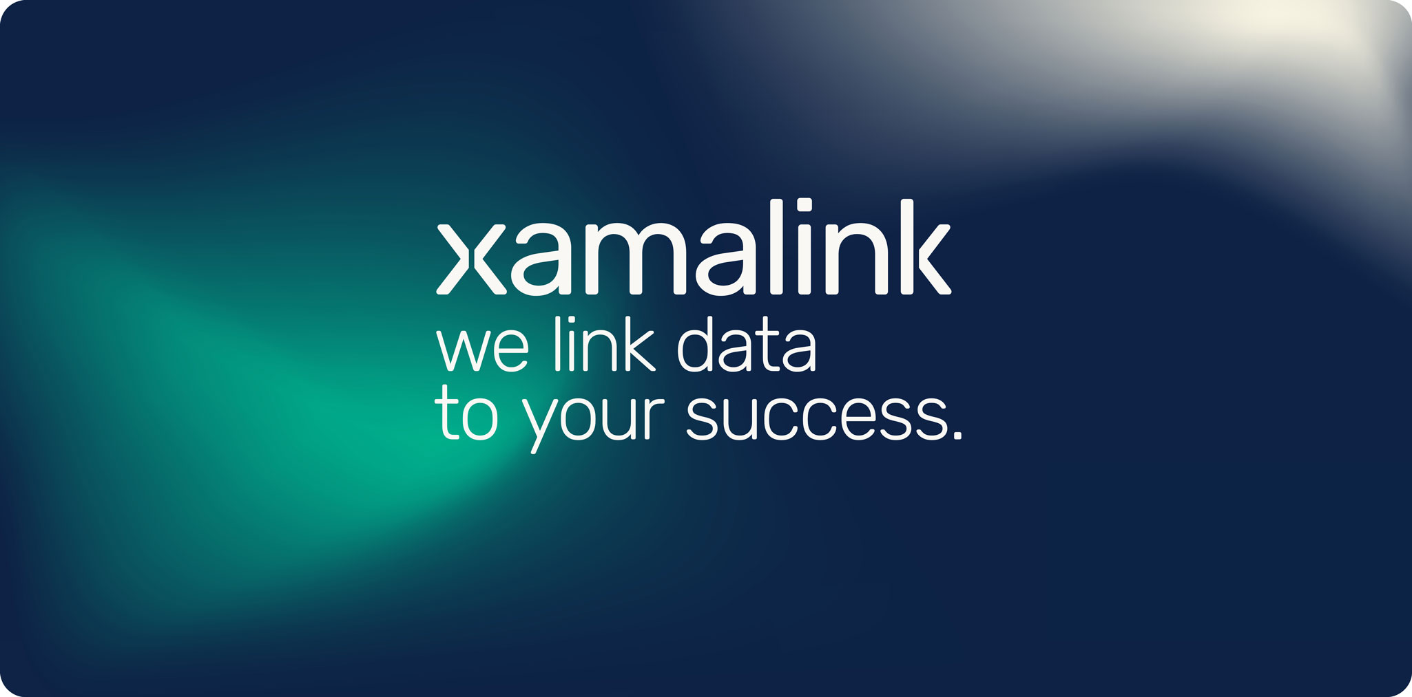
From brand strategy and logo design to the complete design system: through a focused co-creation process, we developed a flexible corporate identity with a distinctive visual language. Starting with logo variations, we defined a color palette, refined the typography, and crafted a visual system that extends across social media assets, presentation templates, and a website showcasing real-world use cases.


client — Xamalink
services — branding, visual language, iconography, infographics, presentation templates and linkedIn assets
items — logo, brand materials
design collaborating – Sophie Dobrigkeit
strategic collaboration — Zielwerk
> Xamalink