Galerie Hanna
Bekker vom Rath

Visual identity for Frankfurt gallery
How much history can a logo hold?
A new visual identity was created for the Galerie Hanna Bekker vom Rath in 2016. The starting point was the unusually long name and the question of how the gallery's history could be translated into a contemporary form.
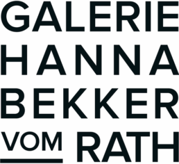
The wordmark, which sits at the heart of the visual identity, condenses the name into a compact typographic symbol. Its constructive aesthetic evokes the beginnings of the gallery and the Modernist movement with which Hanna Bekker vom Rath is closely associated. The design remains deliberately understated, leaving space for the illustrations.
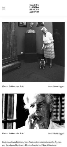
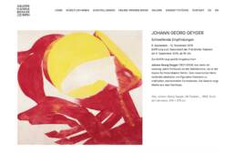
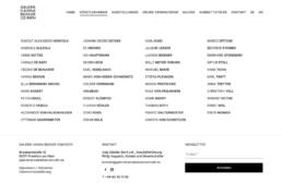
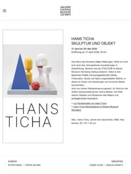
Since 2016, the visual identity has been used for exhibitions, invitations, corporate stationery and the website. The system has remained virtually unchanged over the years.
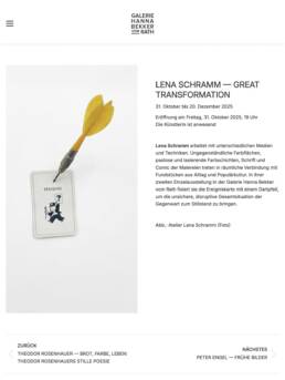
ClientGalerie Hanna Bekker vom RathScopeBranding, Print, UX/UI PlatformWordPress ElementsLogo, Stationery, Website, Invitations, Catalogues